12 Dec Classroom Design 101
For some, a classroom is just a classroom; a room with desks and chairs occasionally a teacher at the front giving a lesson. However what some people may not know that there is some science (like everything else these days) behind the way you should be setting up your classroom. The great minds at USC Rossier School of Education have determined that Layout, Colour, Walls, Lighting, and Digital Spaces should all be considered when designing your classroom.
The average school aged student will spend and estimated 11,700 hours of their lives inside school buildings. Easy changes can be done to ensure higher academic performance such as a fresh coat of paint, more natural lighting, and a less cluttered classroom. These changes can reduce disruptive behaviour and keep students on task. Below are the 6 surprising ways a well-planned classroom can improve the overall success rate of students.
Layout
As we have mentioned time and time again, collaboration in the classroom is a must. This unanimous decision amongst teachers, students, and parents is helping create the driving force behind the importance of layout. The “Balanced Learning” movement is pushing teachers to create space for independent work or making clear pathways to access supplies in their classrooms. The result a 45% increase in academic engagement.

- Define learning zone (reading nooks, computer corners, reading or study area)
- Create a space where small groups can work independently and still be connected to the rest of the class
- Try to keep focal points away from the entrance/exit to minimize distractions caused by incoming or hallway traffic.
Colour
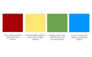
The usage of colour in your classroom needs to serve a purpose. Colour in general can decrease eye fatigue and increase student’s productivity. So use colour strategically. Pro-Tip: schools may not allow budget dollars for you to paint or redesign your classroom, so turn the task into a volunteer opportunity for students and parents.
Walls
One of the easiest ways to improve student focus, engagement, and memory is De-cluttering. YES! It is as simple as removing the clutter on the walls and personalizing student spaces. The USC school of Education suggests these three things:
1) Keep 20 – 50% of wall space clear to optimize student focus
2) Neutral Background Colours such as beige or white help students focus on the lesson, not the walls.
3) Factors such as visual clutter and crowding can distract students
Light
Natural light is the best FREE design tip for improved student learning. Students who are exposed to more daylight in the classroom score 26% higher on math and reading tests that those students with less exposure. The obvious of course is to keep your windows clear and open. If you are in a room that lacks natural light make sure you are using electric light to supplement natural light. If that isn’t possible for you or if you then try desk lamps to create a warm atmosphere in smaller areas like reading nooks.
Digital Spaces
Learning spaces go far beyond the classroom walls and windows. Display screens and audio systems are integral to successful digital learning experiences. Learn more about our selection of Mimio classroom products. But if you don’t need to buy new products the below should be able to help you.
- Eliminate Extra words, pictures and Media from the screen.
- Add visual cues like highlighted or bolded text to call out important information
- Create user-paced and student-centres lessons that meet different learning styles.
- Use a conversational and friendly tone.
Still have questions? Contact our sales team and we will be able to help design your classroom.


No Comments