15 Mar How to Add Colour & Character to Your Classroom This Spring
The days getting longer can only mean one thing: spring is coming! It’s one of our favourite times of the year, and we’re super excited to welcome kids back to our schools in time for the new season. We’re kicking off spring 2021 with some top tips on injecting some colour and character into your classroom. Check it out and don’t forget to check out our blog for more expert advice from Jonathan Morgan & Company!
So – why does color even matter in our classrooms? The answer to that is relatively simple: color is an important part of our everyday lives and often decides how we perceive the environments around us. They affect our emotions, feelings and levels of concentration; stimulating our moods – sometimes positively, sometimes negatively.
Children spend the vast majority of their school day inside a classroom. Whilst furniture selection and classroom layout can play a big role in classroom performance, the importance of color scheming is often underrated. So – how can teachers enrich their students’ learning experiences by making the right color choices?
Classroom Color and Educational Performance
The color of furniture, walls and fixtures in your classroom will impact upon the performance of your students. Over the decades, we’ve seen lots of studies on the relationship between colour and emotion. We’ve picked out some of the most popular colors and what they mean to kids:
- Green: Green is one of the most popular colors seen in classrooms, and it’s not hard to see why. Ambient and harmonious, green strikes a fine balance with the nature that surrounds us. Overall, this color supports positive emotions in classroom environments.
- Blue: Looking towards the sky helps us find inner peace, and using this color in interior spaces can encourage the same effect. Research has repeatedly cited blue as facilitating feelings of order, direction and peace amongst children; making it an ideal choice for learning environments.
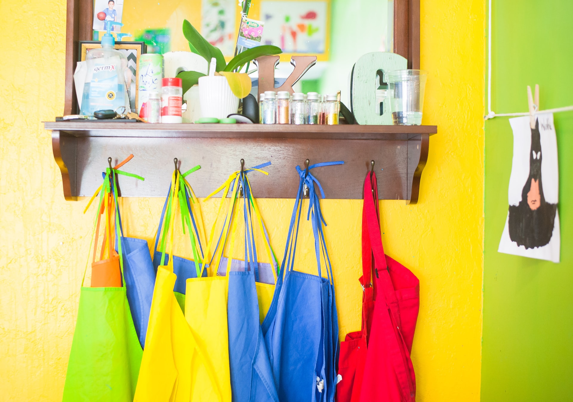
- Yellow: It’s bright, airy and wholly positive. Yellow recalls memories of sunshine, renewal and hope, making it perfect for any spring redecorating.
- White: The purest of all colours, white facilitates feelings of peace and completion. It’s also bright and very neutral, fitting in with the vast majority of classroom colour schemes. If in doubt, paint it white!
Adding Color & Character to Your Classroom
Adding color and character to your classroom can take a little bit of thought. We’ve shared some top tips on choosing colours that create happy, ambient and productive spaces:
- Watch out for glare: This is a big one. After all, nothing is more annoying than dealing with glare – especially when you’re trying to concentrate. Glare bouncing off a wall finished in a high-gloss, vivid color can really impact on classroom performance – so take care around your color selection and where you place your lighting.
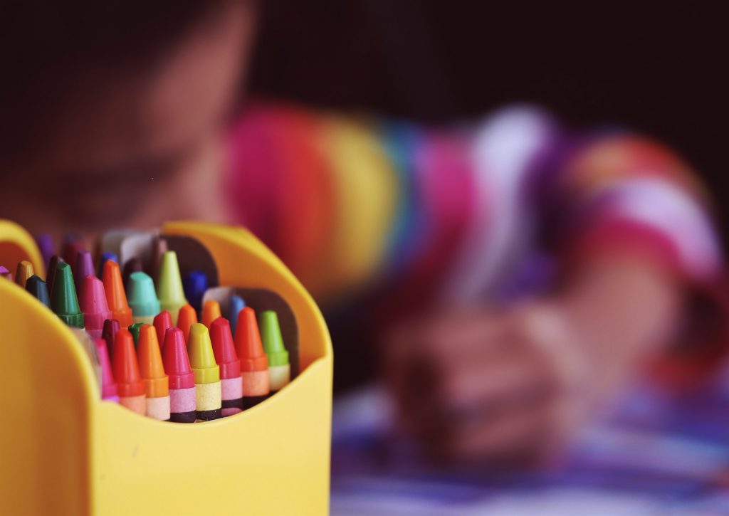
- Use a color combo: Painting your classroom in one color is a one-way ticket to boredom and poor concentration. By using a combination of colors, you can ensure those colors compliment each other; stimulating learning and social interaction without causing a distraction.
- Choose bright: Research has proven that lighter, more ambient colours like yellow & blue encourage positive emotions whilst darker tones like deep blue, brown or black create negative emotions (red has even been shown to cause anxiety in kids). When redecorating your classroom, it pays to make bright colors your default choice…
- Bring the outside inside: Here at JMC Design, we’re big fans of bringing the outside indoors with beautiful shades of green and blue. You can take this to the next level by experimenting with plants and adding posters to compliment natural colors.
- Involve your furniture: Don’t leave your furniture out of your classroom decor plans – include it! Classroom furniture is usually chosen based on functionality, ergonomics and durability. However, color is just as important to enriched learning.
- Don’t overstimulate: We’re all for bright colors – but don’t overdo it. Using bold, garish and overly saturated colours can actually overstimulate your pupils and adversely affect their concentration & classroom performance.
Want to try adding some character to your classroom? Add a splash of colour!
Add Character to Your Classroom with JMC Design
Are you looking forward to a spring 2021 classroom revamp? We’d like to hear from you! JMC Design brings together an industry-leading team of interior designers to design, build and furnish classrooms for modern, productive learning. To get started, get in touch with a member of our helpful sales team.
How History Has Changed Classroom Design | JM&C
Posted at 14:53h, 08 September[…] The relationship between colour scheme and classroom performance is proven, and it’s something we’ve discussed before in our blog. A greater understanding of child behaviour and colour psychology has allowed interior designs to […]